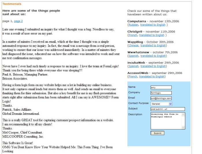
How to direct your form to another url once it is submitted (post submit url)

when someone fills in your form and presses on “submit” the data entered is by default saved and sent via email, a small thank you message appears in a little window and the data in  form clears after that.
if you wish for the user to be redirected to another web page after submitting the form you can do so by using the “post submit url” option. You can redirect to a page in the internet (such as cnn.com), you can redirect to one of your website pages (you can create a thank you page and redirect to it) or you can direct to one of your existing FormLogix forms.

Steps to add the post submit url to your form:
1- enter you form in the form creator
2- go to the “form settings” on the right
3- in the “post submit url” field enter a web page url or use the url picker […] to choose a formlogix form.

4- Press on “apply”.
5- Save the form.

* Please note that the new url will open in the same window as the original form. If you wish to open the new url in a blank new page please follow the steps detailed below.

Opening the post submit url in a blank window:
why open the new url in a new window?
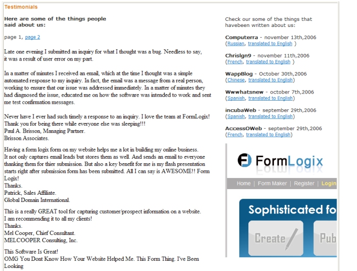
Forms that have a post submit url and are published as iframe/script always show the post submit url inside the form window container. This means that the directed url will appear in the same dimensions as the original form and that if it is larger than the form’s dimensions it will be cut (see the 2 following images below). The best solution is to open the url in a blank window.

Sample of an embedded form (using a script/iframe publish method) – prior to submit
embed1


Sample of an embedded form  – after submitting the form – post submit url to the FormLogix homepage  gets cut and all you see is the left top part of the page
embed2

Steps to open the url in a new window:
1) Create a new blank web page in your website (Name the page: gateway.html)
This page should remain blank apart from this code which should be placed between the webpage’s ‘Head’ tags:

<script>
window.parent.location.href = ‘http://www.ThePostSubmitSite/ThePostSubmitPage.html&#8217;;
</script>

For example:
<script>
window.parent.location.href =’http://www.cnn.com&#8217;;
</script>

2) Go to ‘Form Setting’ and fill the ‘Post Submit URL’ textbox with the url
of the gateway page – http://www.yourdomain.com/gateway.html

   3) Press “apply” and save the form

Designing the form-how to beautify the form?

Since the form builder has no rigid layout and the design is flexible one needs tools to help him design his form:

Colors, borders  and fonts
background color
you can change the background color from the design toolbar (third from the top) which allows you to choose from a list of colors or from the form settings on the right, in which you can insert any color number (for example: #ffffff).
bg_toolbar
or
bg_side

Font color
you can change the font color from the design toolbar font color list or from the font color field in the element settings.
font-color


Font style

You can control the font style from the design toolbar by setting the font family, size as well as determining if the font is bold, underlined or italic.
font-family

Borders
You can change/add borders to elements by using the border style in the design toolbar.
Choosing border style (solid, ridge etc), width (in pixels), and color (from a color list).
border-style

Element alignments and Spacing

Alignment using a grid
the grid is a network of horizontal and vertical lines that covers your design area. Using this option may be done by turning on the “show grid” and “snap to grid” checkboxes located in the element toolbar. Once you turn the grid and snap on all selected Elements will be pulled into alignment with the nearest intersection of grid lines.
find out more about the grid
grid

Alignment options (left, center, right, top, middle and bottom)

You can align a few elements together by using the alignment options in the design toolbar.  By choosing a few elements (by selecting them with the mouse while the “ctrl” key is pressed) you can choose to align all the elements to the left, for example. All element will align according to the element which resides furthest to the left.
find out more about aligning tools

select the elements and press on “align left”

align-1

the elements will align left
align-2

Same spaces between elements (horizontal and vertical)
You can select a few elements that have a different vertical spacing between them, for instance,  and by using the “make save vertical space” option you can change the spacing between them to an equal one.

select the elements and press on “make same vertical space”

make_same_sp[ace-1

the elements will be arrangedwith an equal vertical spacing between them
make_same_sp[ace-2

1-      Images
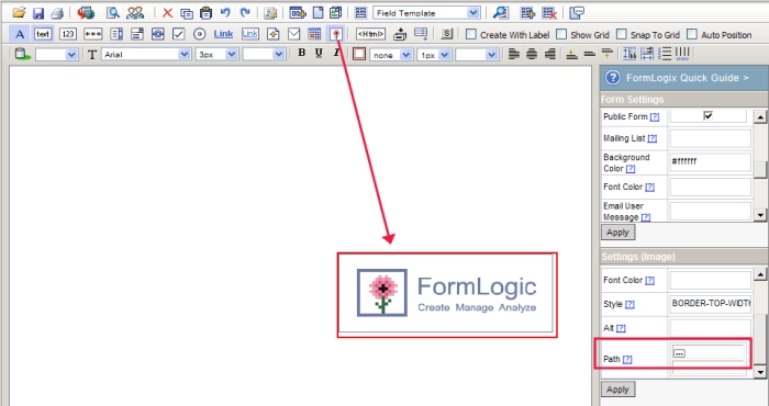
you can add images to your form and even place elements on top of them to act as backgrounds. This can by done by simply dragging the “image” element on to the design area. A default formlogix image will appear and you will be able to replace it with your own from the element settings (using the “path” field). Please notice that you will need to change the image width and height according to your image’s proportions.
image1

How to create an online wedding invitation – RSVP

Getting married? Want to use an online wedding invitation- RSVP? No problem – you can build an online invitation form yourself.

An online wedding invitation is a great solution for all you busy people (and really…who isn’t busy when planning a wedding?) who do not want to find out whether or not people are coming by letters or phone calls. Why waste time when you can find out via email?
A wedding is a happy occasion that is never taken lightly: planning the event takes up lots of time and efforts. Finding the right venue, catering, music, cake, dress and suit, shoes, hair dresser, makeup artist, bouquet, rings, minister, honeymoon etc…the list of things to is really long. When you put such efforts in this event you really want to make sure that your guests are coming…this is where an online wedding invitation comes in.

The best thing about creating the form using a form builder tool is that it is really easy and no programming skills are required whatsoever. In addition, you do not need to install or download anything because the form creator is a web tool.

What are we waiting for?  Want to know How to create a wedding invitation?
here’s a step by step manual:

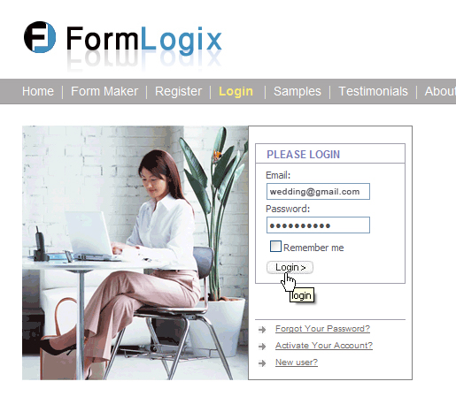
1-      login to the form creator
wed1-login

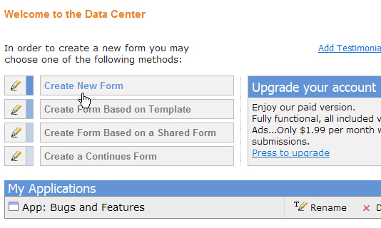
2-      in the data center – choose “create new form”.
wed2-new

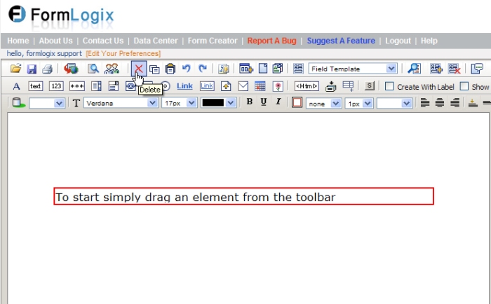
3-      If you have the initial help label on the screen (“To start simply drag an element from the toolbar”) press on the “delete” icon to remove it.
wed3-del

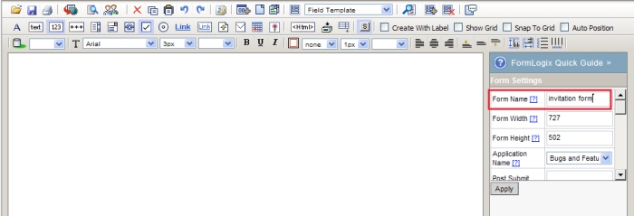
4-      Go to the “form settings” on the right and give you form a name
wed1-name

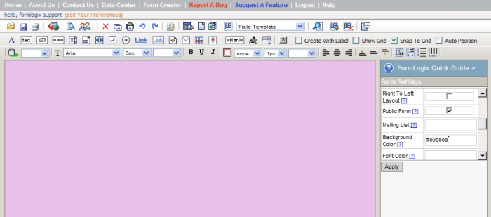
5-      Change the background color of the form (I chose the color # e9c0ea, but you can keep it white if you like…)
wed4-bg

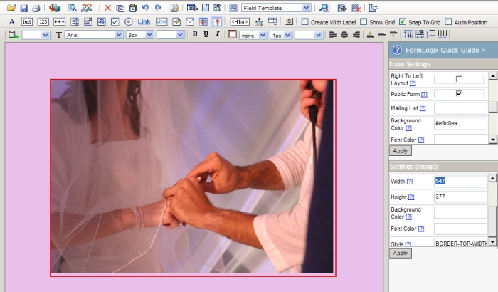
6-      Add an image of your choice (a picture of you and your boy friend/girl friend, 2 love birds, puppies, flowers, or whatever you think is suitable) by dragging the “image” element. Make sure to enter the actual width and height of the image in the “element settings” so the picture will not be distorted.
wed4-img
wed5-img

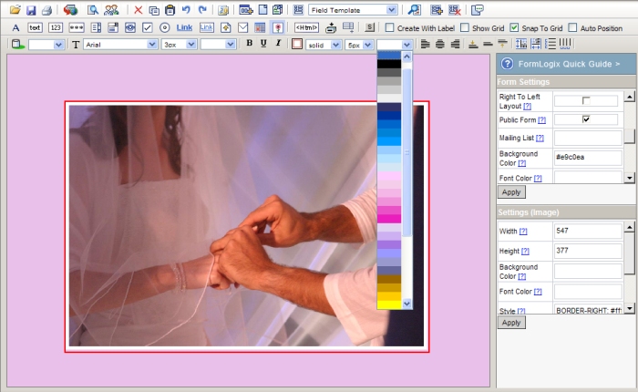
7-      Add a 5 px white border around the image by using the border style options in the “design toolbar”.
wed6-border

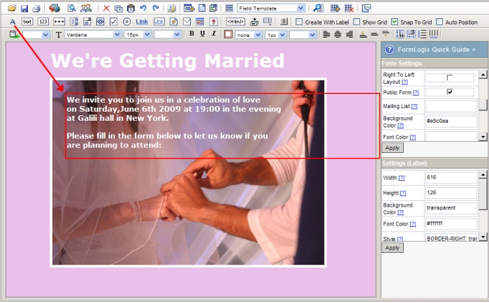
8-      Drag a “label” element from the “element toolbar” above and change the text in the “element settings” on the right to :”we’re getting married”
wed7-label

9-      Change the font family, size and color of the font (verdana, 37px, white, bold) using the design toolbar.
wed8-label

10-   Drag another label element and enter your invitation text :  “we invite you to join us…”. Again, change its style as you wish.
wed9-label

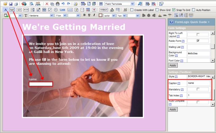
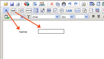
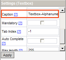
11-   Drag a textbox element and go to its element settings. Enter the text  “name” in the caption (this will be the element’s name in the system now) and enter the digit 1 in the tab index field.
wed10-label

12-   Drag a label and place it above the textbox. Change its text to “name”.

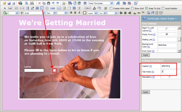
13-   Drag a checkbox from the “element toolbar” above and go to its settings on the right. Call it “attending” in the caption and enter the digit 2 in the tab index field.
wed11-checkbox

14-   Drag a label and place it above the checkbox. Change its text to “attending”.

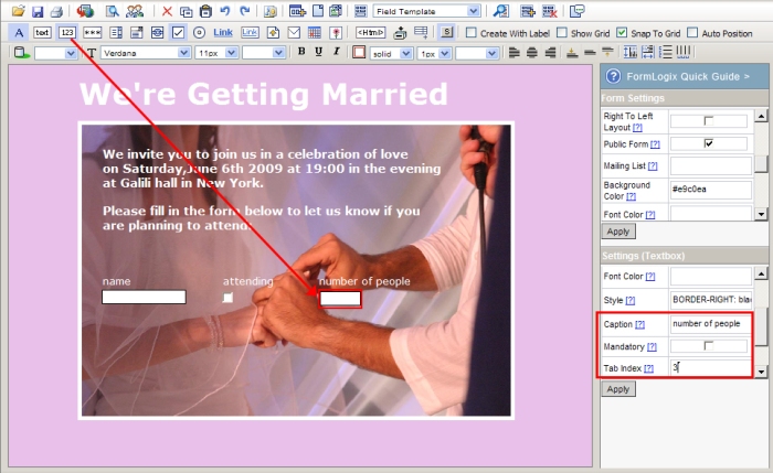
15-   Drag a numeric textbox. In the settings call it “number of people” and enter tab index=3.
wed12-num

16-   Drag a label and place it above the textbox. Change its text to “number of people”

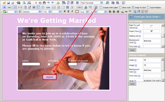
17-   Drag a submit button. In the element settings change its background color to # e9c0ea.
wed13-button

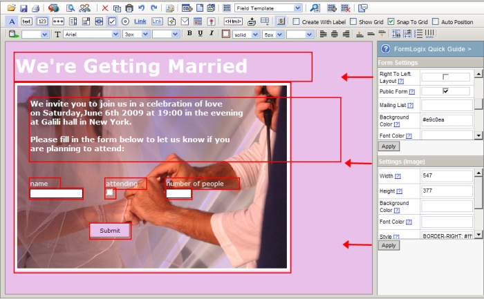
18-   Select all elements in the form (by pressing “ctrl”+a) and move them to the left.

wed14-move

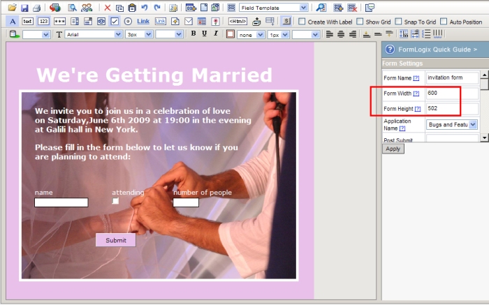
19-   Change the form’s width to 600px and press on “apply”.
wed15-size

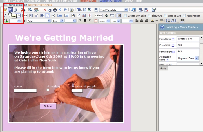
20-   Save the form.
wed16-save

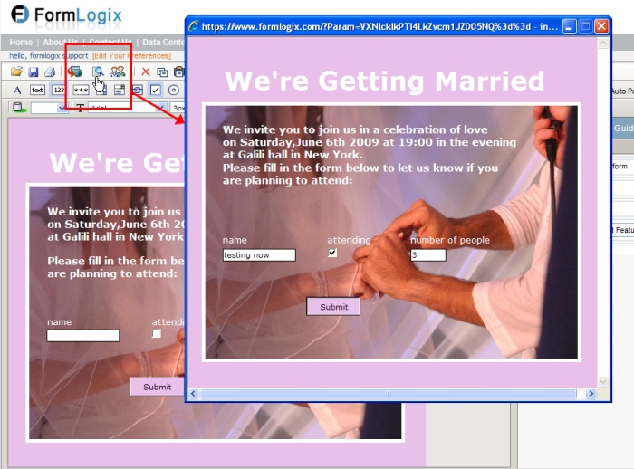
21-   Preview the form in order to test it
wed17-publish
That’s it!  Your form is done!  All you need to do now is publish it.
stay tuned and find out more about how to beautify your web form.

How to choose the right elements for your form

The formlogix form builder contains a variety of elements designed for creating  forms.
All elements may be dragged and dropped on to the design area and all have settings that may be changed according to the form owner’s needs.

Each element is designed to fulfill a different function and should therefore be used in different circumstances. Following is a description of each element and its most important settings.

1-      Label
the label is a textual element that is used to add text to the form (titles, descriptions, etc). The label is most commonly used as the name of the field which is placed next to an input element.
label

2-      Textbox
the textbox is the most common input element. It is used to collect alpha numeric data (letters, numbers and characters). This element‘s settings include important features such as: Mandatory (forcing the user to fill in this field), max length (determining how many characters may be entered in the field) and auto complete (an option which guesses the word/phrase while being entered and completes it).
textbox

3-       Numeric textbox
this textbox element is used to collect numeric data only. Its settings are identical to the regular textbox.
numeric_textbox

4-      Password
the password element is designed to collect alpha numeric data (just like the regular textbox). The only difference is that this field hides the characters while they are being entered. The field’s settings are identical to the regular textbox.
password

5-      Textarea
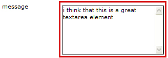
the textarea element is used to collect a multi rowed text data. Its settings are identical to the regular textbox (max length is limited to 675 characters).
textarea

6-      Listbox
the listbox element is used to offer the user a list of options from which to choose from.

the important settings of this element are the “items” in which you enter the list values and the mandatory checkbox (take note-when using this option you must see that the first value in the items list is a title text such as: “please select” or “choose”)
listbox

7-      Linkform
the linkform element is a dynamic dropdown list. The values in this list are driven from another form and that is why it is called linkform (links between forms).
linkform
Read more about linkform

8-      Checkbox
the checkbox element has 2 states: off and on and it thus giving the user 2 options to choose from. Defining the checkbox as mandatory in the element settings will force the user to turn on the checkbox prior to submitting the form.
checkbox

9-      Radio button
The radio button, like the listbox, offers the user an array of options, only they are presented alongside each other in a horizontal layout (and may be shown vertically as well.) important settings:  vertical checkbox- turns the radio items layout to a vertical one. Width- the form owner can define a fixed space between each radio button to another.
radio
read more about the radio button

10-   Link
this element is a link to another form or a chosen url that may be inserted to the form.  
The important settings in this element are: url – the field in which the url of the link is defined. You can enter a url or use the picker […] to choose another form. New window checkbox – if this checkbox is turned on the link will be opened in a blank window when pressed.
link

11-   Linkbox
the linkbox element is designed for collecting links. It has no special settings.
listbox

12-   File upload
the file upload element  is used to attach documents to the form. The file types that may be uploaded are:  gif, jpeg, png, jpg, tiff, pdf, xml, htm, html, txt, doc, xls, pff, rtf, zip, mp3, avi, wav, wma, rar, xlsx, docx, dwg, skp. There is also a limit of 1.5mb per file.
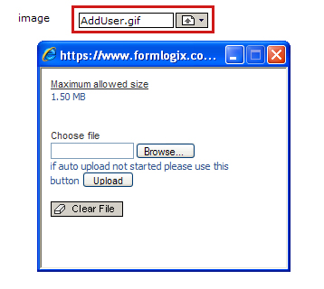
upload

13-   Email
this element is designed especially for collecting email addresses. When this element is defined as mandatory in the element settings it turns on a validation mechanism that makes sure that the email address is valid. This element also has a “send copy” option which sends a carbon copy email containing the data entered in the form to the form filler.
email

14-   Calendar
the calendar element allows the user to enter a date made of the day, month and year.
it can be defined as mandatory.
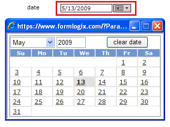
calender

15-   Image
this element enables the form owner to add images to the form and even use them as backgrounds by placing other elements on top of them.  Choosing the image is done using the “path” field in the element settings. An “alt” may also be added to the image. Notice that when choosing your image you will need to enter the right width and height since a default width and height are used.

image

16-   Html
the html element is designed to allow inserting html scripts. It does not have any special settings.
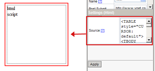
html

17-   Container
the container element is used to contain other elements in it. When elements are placed in the container and the container is moved than all elements move with it without changing their relative position.
Special features that may be assigned to this element in the element settings are: private access checkbox – defining that all fields inserted to the container will not be visible to the form filler, but only to the form owner. This is used to add comments to entries after they are filled in. Mouse over color/Mouse out color – with these fields the form owner can create a roll over effect on the container.
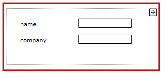
container

18-   Multi line mode
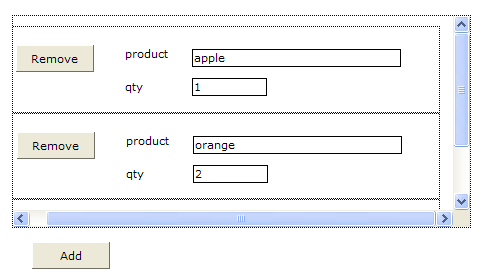
this is an advanced element and is not commonly used.  This element creates a repeatable section and allows the user to insert as many data rows as he wants by pressing on the “add” button, or canceling them by a “remove” button.  This element is usually used in order forms.
multiline

read more about multiline mode

19-   Submit button
This element is used to submit the form. The special options in the element settings are:  text- changes the text on the button.  Reset button checkbox – turning on this option will change the button to a reset button which clears the fields in the form when pressed.
submitbutton

How to publish your web form

so you finished your contact form? All is good and well, but how do you embed it in your website? How do you use the email form?
well…the answer to this is really simple – Once your web form is finished and saved all you need to do in order to use it publicly is “publish” it.
publishing a form means externalizing it. Generating its code and using it in order for other to fill data in it.
There are 6 different publishing methods in the form builder. Choosing the right publish method depends on your needs – whether you want to embed the form to look like an integral part of your site or blog, or you want to use its url as is or as a link.  Once you choose a method (by selecting the radio button value) a generated script will appear and you will only need to copy and paste it.

The 6 publishing methods are:
URL – this is the url of the form. This url can be placed in a link or sent to others so they can enter the form. O simply given as is to enter in the browser’s address bar.
IFRAME – this code is used to embed the form in blogs.
LINK – this code is used to add a link for others to enter the form through.
SCRIPT – this code is used to embed the form in a website.
MAIL – when you choose this option a your mailing system window will open, allowing you to send an email, containing a link to the form.
GOOGLE SITES – this code is suitable for those who wish to put a link to the form with-in “Google Sites”.

form publishing options

read more about the publish option.

Newcomers to web forms – Create a simple contact form

Welcome to the form creation domain. Today I will show you how easy it is to create a simple contact form for your website.
A contact form is a very common form that most websites use. This email form enables users to get in touch with the website owner/web master in regard  to various issues such as sales, support, feedback etc.

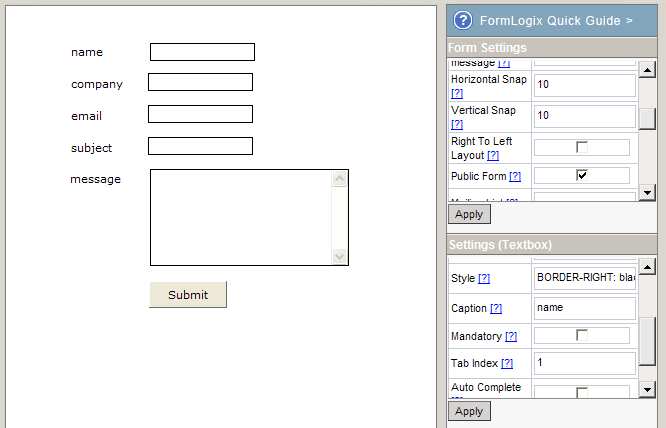
Let’s get started – Following are the steps to create your contact form:

1-  Make a form plan. Decide on the data you wish to collect and the way you want your form to look and make a written plan. What data is important to you? Do you want to collect the form fillers name? is important for you to get his address? Do you want the user to categorize what the contact purpose is or will you be satisfied with him describing the purpose freely in a multi row free text field?
What would you need to do in order to nicely embed your form in your website? Would you want the form to have a certain background color? Font family and size? Would you want to add an image to the form?
These questions are important in order to decide on the fields you want to create.

2- Enter the form builder and set the form name and size in the form settings on the right.
 on to the design area:

3-  start dragging the elements

Name field –  Textbox element
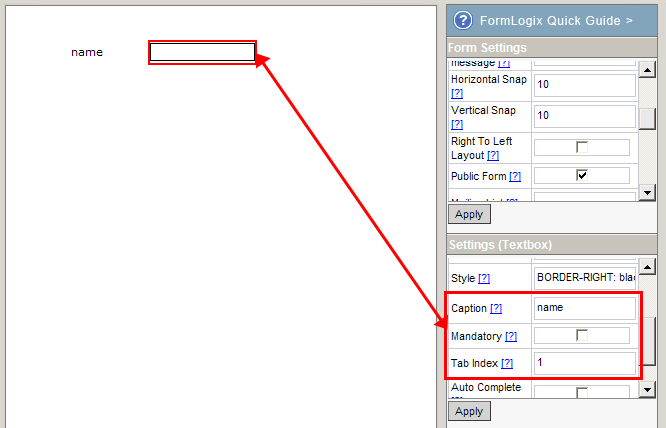
–          Drag a textbox for collecting the form filler’s name. Go to the element settings on the right and change its caption to “name”.  set the tab index number to “1”. Press on “apply”.
–          Drag a label element and place it next to the textbox. Change its text in the label’s settings to “name”. Press on “apply”.
addelements

elementcaptiontab

Company field- Textbox element

–          Drag a textbox for collecting the form filler’s company name. Place it below the name textbox you dragged earlier. Go to the element settings on the right and change its caption to “Company name”.  set the tab index number to “2”. Press on “apply”.
–          Drag a label element and place it next to the textbox. Change its text in the label’s settings to “Company name”. Press on “apply”.

Email field – email element

–          Drag an email element for collecting the form filler’s email address. Place it below the company textbox you dragged earlier. Go to the element settings on the right and change its caption to “Email”.  set the tab index number to “3”. Press on “apply”.
–          Drag a label element and place it next to the textbox. Change its text in the label’s settings to “Email”. Press on “apply”.

Subject field – textbox element

–          Drag a textbox element for the subject. Change its caption and tab index as you did in the previous elements.
–          Drag a label element and place it next to the textbox. Change its text in the label’s settings to “subject”.

 Message field – textures element

–          Drag a textarea element for the message field. Change its caption and tab index as you did in the previous elements.
–          Drag a label element and place it next to the textarea. Change its text in the label’s settings to “message”.
4-   Add a submit button to the form
contactform
5-
   Save the form  (and…TA DA!…the form is done)

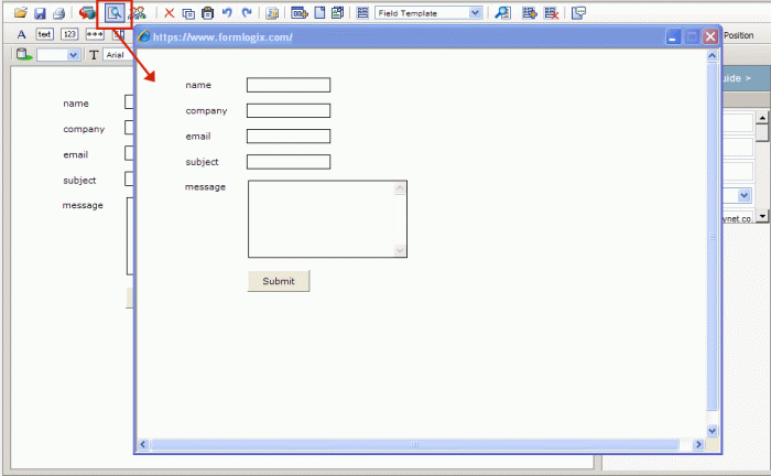
6-   Press on “preview” (in the general tobar-5th icon from the left)  to check the form.
preview

The Essential Basic Settings in Form Creation

The form creator consists of many features and options that may be applied in order to create a specific form. However, there are a few essential basic form and element settings that need to be entered in each and every form. These settings are crucial to form’s most basic functions. They consist of:

1-      Form name (included in the form settings).
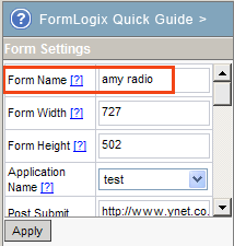
 While each form has a default name (“new form”) and the user is not obligated to change it- it is highly recommended to do so in order to distinguish between the different forms in future operations (such as distinguishing between the forms listed in the data center, or trying to figure out from the new data alert email to which it belongs).
formcaption

2-      Caption (included in the element settings)
The caption is the element’s name in the system.  While it is not mandatory to enter a name it essential for the efficient use of the system since this caption name will later appear in the email sent to you, in the data management report and in other places and it will be the only way you will be able to distinguish between your elements.
elementcaption

3-      Tab index (included in the element settings)
The tab index is an ascending number (starting from 1) which is given to all element s in order  to determine their order. This order is implemented when the form filler tabs from element to element.
This is not a mandatory feature but it determines the order of element in the data center report and elements listed in the emails sent to you.

How to work with the Form Creator – get to know the work area

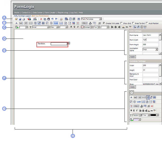
The form builder has a really simple layout – it is essentially divided into 3 functional sections:

1- Three top menus
A) General Toolbar
B) Element Toolbar
C) Design Toolbar
These 3 top menus contain form element (such as textbox, email element,radio button,listbox etc), style options (such as background colors, fornt sizes) and  important general options such as save and publish.

2- Settings on Right side
D) Form Design Area
E) Property Grid – Form Settings
F) Property Grid – Element Settings
G) Secondary Side Toolbar
The right side in mainly dedicated to settings. Form settings consist of general settings which apply to the entire form (such as form name, form width and height, post submit url etc). Form settings consist of the settings applied in the element itself (such as element background color, element tab index, if it is mandatory etc).
The secondary toolbar, which also appears on the right side has nothing to do with the settings. this toolbar it is an optional  toolbar which contains a mix of options from all 3 topbar menus and is active when the user creates a long form and cannot see the top menus due to scrolling down.

3- Main work area
H) form creator work area
This is the white (by default) area in the center of the form creator. You can place the elements on it freely or use a grid to snap elements to. (snap grid options are on the element toolbar-B)
creatorworkarea

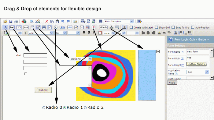
Once you enter the form creator you can immediately start creating your form by dragging and dropping elements from the “element toolbar” (B) on to the design area (H).
Each element you drag on to the design work area may be placed wherever you wish – the design is flexible.

Whenever you select an element a red border will appear around it and its settings will appear on the right side (F). Using these settings you can change the element’s style (such as the background color) its tab index number, whether it is mandatory and so forth.

See the complete “element settings” list.

Stay tuned for the next post which will cover the essential settings needed when creating your form.

What is a form creator?

A form creator (also known as a form builder or form generator) is a tool designed to automate the form creation process and enable those with no programming skills to create a web form themselves.

FormLogix is such a form builder and it enables its users to create an endless variety of web forms (contacts forms, surveys and polls, feedback and order forms etc.) in a flexible, easy and  WYSIWYG (WYSIWYG =what you see is what you get) way. The form creator is a web application which does not require any installation or download. All you need to do is register, login and start working.

Don’t worry about not having the experience or knowledge in programming or database, all you have to do is drag and drop the elements from the toolbars and design the form (place the elements where you want, choose a background color for your form, add image, choose font family and size etc).
While you are simply constructing your form the database is created behind the scenes for you. This will allow you to store the data in a table and manage it later on.
flexible-design

This email form,  once saved and published,  will allow others to fill in data, will alert you via email upon each data entry made, and will enable you to manage the data entered using a data management tool.
Read more about the Form Maker

What are you waiting for? Let start creating forms! -follow me…