Using a listbox in your email form

This post will focus on the listbox element and demonstrate how to use it.
Attached is a link to a tutorial movie about using the listbox as well as a step by step written instruction on how to use the listbox.

The tutorial : Using the listbox element

Steps by step detail on how to use a listbox:
1- Drag the listbox element into the form design area.
2- you can change its width by stretching it or using the width attribute in the listbox settings.
3- Press on the items button in the listbox Settings.

4- don’t forget to give the listbox a caption and tab index number
5- Open the items list in the ‘listbox settings’ and fill in your items as needed.
once your item list is complete close the window and press on ‘apply’
6 – you can always add items to the listbox by opening the ‘items list’ and pressing on the “Add Item” button. The new item row will open at the bottom of the list and the new item entered will be placed there.
7- You can also remove items from the list at any time by pressing on the minus icon in the ‘item list’ window.
8- if you wish to change the items’ order you can do so by selecting an item (standing in its row) and pressing on the “up” or “down” arrows (depending on where you want to move it).

Adding and image to your email form

An image is one of the elements you can insert in to your email form.
Adding an image in the form builder is a very simple thing and just like adding all the other is done in a ‘drag & drop’ motion.
Once the image is dragged to the design area you will see a default Formlogix image. You will then need to go to the ‘element settings’ on the right (while the image is selected) and upload your image.

The image you upload will appear in a default width & height, which means you will need to change these attributes to the right width and height of the image (in the image settings on the right).

If you want to make the image bigger or smaller you can do so by changing the width & height or by simply selecting the image and stretching it.
A border may by added around the image using the border style options in the ‘element style’ section in the top toolbar.
In addition an alt text may be added to the image (in the ‘image settings). This text will appear while the user hovers over it.

Watch a tutorial about adding an image to an email form

Take a tour in the form builder

The form builder is where you can create an endless array of email forms (once the form is submitted an email is sent to the form owner):
Contact us forms, Feedback forms, Events registration forms, Surveys, online Polls, Order forms, Invitations etc.

The form builder is a WYSIWYG tool. This means that while you are creating and designing the email form you can actually see what the form will look like when it is used.

It consists of many features and functions, some are necessary for the form creation process and some are special features which may be used when needed.

This tour will focus on the main functions you should know in order to create a form in the form builder:

1- Giving the form a name
    the first attribute in the ‘form settings’ (on the right).

2- Determining the form’s dimensions: width & height.
If you plan on embedding the form in-between other items in your webpage than this is really important. The width and height are located in the ‘form settings’ and are in pixels.

3- Dragging the elements of the form.
All elements are located in the ‘elements’ section in the top toolbar.
You can either drag each element separately or drag every element along with a label (by turning on the ‘Create with label’ checkbox in the ‘alignment & spacing’ section)
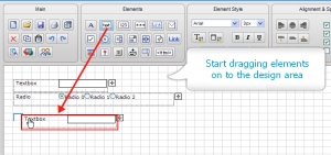
4- Using the grid to align the elements
by turning on the ‘show grid’ and ‘snap to grid’ checkboxes (located in the ‘alignment & spacing’ section) you can easily place your elements where you want and have them be aligned.
Read more about the grid
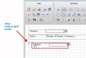
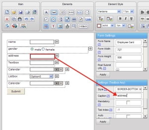
5- Giving the Elements a caption
each element has a default name when it is first dragged, but this name can and should be changed (since it later appears in the data management report, in the emails and so on). In order to give the element a name you need to select it and go to the ‘element settings’ on the right.
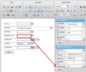
6- Giving the elements a tab index number
This attribute is situated in the ‘element settings’ and allows you to determine the order of the fields in the form (this order will later be used in the data management report, in the emails etc.)
read more about tab index
7- Saving the form.
this may seem trivial, but when you are working with a web tool you should always make sure you save your form several times while you are in the process of building it and not only in when you are finished.

8- Auto response
by using this feature you can have a copy of the submitted form be automatically sent to the form filler. In order to have the form auto reply (or , as we call it, send a ‘carbon copy’ of the form) you need to have an email element in your form – so if you don’t already have one you will need to add it. Once the element is in the form you will need to go to its settings and turn on the ‘send copy‘ checkbox.
You can use this regular auto reply or use the ‘custom user email‘ to create your own email.

9- post submit url
this attribute, located in the ‘form settings’ allows you to redirect the form to another form or another url once it is submitted. All you need to do is use the url picker to select a form or fill in a valid url and press ‘apply’.

Read more about post submit url

10- Publish
Once the form is completed and saved you can publish it. Publish means to make it accessible to others, to make it public.
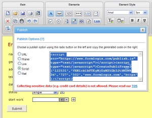
In order to publish your form you need to press on the ‘publish’ icon in the ‘main’ section of the toolbar. Choose one of the listed publish methods and copy the generated code.
Read more about publish
Create a simple form with an email form builder

Creating a simple form (such as a contact form) using a form builder is really easy.
In order to help you get started i have attached a link to tutorial movie on the subject and an identical step by step written instruction on how to create this email form.

The tutorial : create a simple form

Steps by step detail on how to build a simple email form:
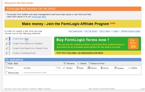
1- after logging in (when you are in the data center) – choose ‘Create new form’ option.

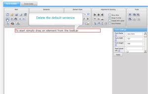
2- Delete the default  sentence  “to start simply drag an element from the toolbar’.

3- Turn on the ‘Show Grid’, ‘Snap to grid’ and ‘create with label’ checkboxes which will help you start designing the form easily:
Show grid – this option makes a grid appear and you can use it to align your elements.
Snap to grid – this option makes sure that when you drag/move an element it will always be pulled into alignment in the nearest intersection of grid lines.
Create with label – this option makes each element you drag be accompanied with a label and wrapped in a container (to save the time and work in dragging the elements and labels separately and placing them next to each other).

4- Start dragging your elements
a regular textbox (for the name field)
a regular textbox (for the company field)
an email element (for the email field)
a regular textbox (for the subject field)
a textarea (for the message field)
a button (for submit button)

Notice that when you drag an element (drag and hold) you will see a blue corner next to the top left element corner. This corner is the ‘snap to grid’ indicator and while you are trying to decide where to place the element, this indicator will show you the nearest intersection of grid lines so you can decide when to let go of the element and place it.

5- Stretch the subject element – simply select it and change its width (either in the element settings or by literally stretching it).

6- Change the message element width – so it is the same as the width of the subject above it.

Use the ‘make same width’ option to make the container and the element itself the same width.

7- turn off the checkboxes: Show Grid’, ‘Snap to grid’ and ‘create with label’ (detailed in bullet #3) – you do not need them anymore.

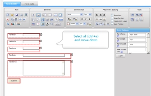
8- Select all the element (ctrl+a) and move them down to make room for the form header.

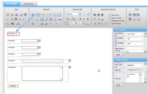
9- Drag a label and change its text to ‘contact us’. While it is selected you can change its style (font size, family, color etc).

10- Change the text of all the labels. Select a label and either double click on it in the design area to change its text or simply change it in the ‘element settings’.

11- Change each element’s caption and give it a tab index number. The caption will actually determine the field’s name and will later appear in the data management, in the emails and so on.  The tab index number- (an ascending order starting with 1) will define the order of the fields (tabbing order, report order, email order).

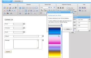
12- Change the form’s background color by using the ‘background color’ icon in the ‘element style’ section.

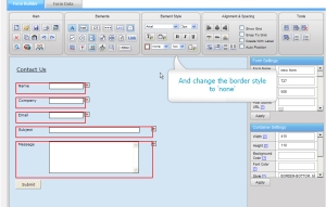
13- Select all the element’s container holder and change the border style to ‘none’. This will make the border invisible.

14 – Align the submit button according to the elements above it. In order to do this make sure that the submit button is located to the right of the textarea above (move it right if you need to).  Select the textarea and the button and press on ‘align left’.

15- Save the form.

FormLogix changes look

A new FormLogix version has just been released providing a change in the form builder look and feel.
The changes are mostly graphic and the functionality was kept the same – making it easier on the user.

 Changes were made in 2 main areas:

1- the form creator and management tool are now operating on the same platform and moving from one to the other will be done using the tabs ‘Form Builder’ and ‘Form Data’.

2- The upper toolbars have been divided into several sections according to their functionality for better user orientation.

Following is a run-down of all the form builder’s and data management tool features and their new location:

The Form Builder toolbar is now divided into:

Main

this section contains the most basic functions in the tool:
new form
open
save
print
template
delete
copy
paste
undo
redo
preview
publish
share

Elements

This section contains the elements you can drag and drop in to the form:
Label
textbox
numeric textbox
password
linkbox
email element
checkbox
radio button
textarea
Listbox
linkform
file upload
link
calendar
image
button
container
multi line mode
html element

Element style

This section contains options to control the styles of the elements in the form:
font family and size
font color picker
background color picker
bold/italic/underlined
border style, width and border color picker

Alignment & Spacing

This section provides options to help position the elements in the design area:
align left/center/right
vertical align top/middle/bottom
make same height/width
make same vertical/horizontal space

Tools

This section contains various tools:
field template
add field template and delete field template
add new application

Read more about the elements

The Form Data toolbar is divided in to the following sections:

Data

Add Entry
Delete Selected Entries
Restore Deleted Entries
Export
Import
Filter
Cancel Filter
Open In Grid (checkbox)

Report & Chart

Create New Report
Edit Report
Create New Chart
Edit Chart
Open
Save
Report/Chart Properties
Share
Print

Read more about the Form Data options

Create an email form with auto response

In the FormLogix form builder an account owner can create an email form and have it send an auto response email to the form filler.

Regular auto response
The regular auto response is a basic carbon copy sent to the form filler.

In order to have the email form auto response you need to:
1- have an email element in the form. If you don’t have it-add it.
2- Select the email element and go to its element settings on the right.
3- make sure that the ‘send copy’ checkbox is turned on and press ‘apply’.
4. Save the form

*Please note-if you wish to add some text at the top of this response email you can use the ‘email user message’ option.
Read more about email user message.

Custom auto response
This option allows the form owner to configure the auto response email content. In order to have a custom email response sent to the form filler you need to:
1- have an email element in the form. If you don’t have it-add it.
2- Select the email element and go to its element settings on the right.
3- make sure that the ‘send copy’ checkbox is turned on and press ‘apply’.
4- Press on the ‘custom user email’ button in the ‘form settings’.
5- Insert the email content in the window. The content may consist of text as well as form variables. You can, for example, start your email with : Dear [627]. [627] in this case is just an example for a variable which stands for the field ‘name’ in a certain form. Using the variable means that the name filled in by the form filler’s will appear in each email.
6- You can also use the ‘edit text’ option to change the style of the email text.
7- Press ‘apply’. Save the form.

Read more about custom user email.

Using the Field Template

The field template is way to store single or a group of fields for future use in the form builder.
Sometimes you create a form and you already know that a part of it will be used again in other forms (such as address and telephone fields etc) – in this case it
would be a smart move to save this part of the data as a field template.

The field template list consists of general templates created by FormLogix that may be used by all users, and custom templates each user can create for himself. Please note that when a form owner creates a field template -it will only appear in his field template list.

The Field option resides in the top toolbar ‘tools’ section and it consists of 3 icons:
1- Field Template List
2- Add Field Template
3- Delete Field Template

Field Template List
This option allows a user to choose a template from the template list and add it to his form. Once a template is chosen it will appear in the main design area along with all the elements of the form. you can then move it, edit it as you wish, remove fields from it…etc.

Add Field Template
This option allows a form owner to create a field template which will be added to his field template list.
In order to add a field template you need to:
A. select the single field or the container holder of the field group (if you want to save a group of fields you must place them in a container element).
B. press on ‘Add Field Template’
C. Give the template a name
(Once this is done you can go to the Field template list and see the new template added there)

Delete Field Template
This option allows a form owner to delete field templates (only those he created) from the template list. All you need to do is choose the template from the list and delete it.

School trip attendance and consent form

Nowadays schools use web forms for many uses such as: surveys and polls, gathering student info, school events attendance etc.

The yearly school trip, like any other large scale event, is a well organized, logistical happening. Many children, teachers and parents attend and there are many services to hire (transportation, sleeping arrangements, sites to see, etc).
For this reason it is highly important to know who plans on attending.
Where the school is concerned it is also highly important to have the parents’ consent – since without their permission the child will not be allowed to participate.

Creating a school trip attendance form is really easy using a form builder. All you need to do is:
either
1. use the “school trip permission form” template, which is located in our template gallery (http://www.formlogix.com/templategallery.aspx).

Or
2. Create this form yourself.

Following are the steps to create the attendance form yourself:
1. Login to FormLogix and choose to create a new form.

2. Give the form a name in the form settings on the right.


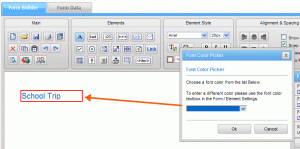
3. Drag a label element and change its text to “School Trip” – it will be the form header.


4. While the label is selected change its style: font, size, color etc.

5. Add another label under the title and insert some text about the school trip and the details you require in the form.


6. Drag a regular textbox from the “element toolbar” at the top (for child name field).


7. While this element is selected go to its element settings on the right and enter the field caption (the field name, which in this case is “child name”). in addition give the field a “tab index” number  (also in the “element settings on the right”).


8. Drag a label next to the “child name” textbox and change its text to “child name”.
9. Drag a radio button element for parent consent and a label next to it. Add 2 items to the listbox – ‘I Consent’ and ‘I do not consent’. Do not forget to give the radio button a “caption” and “tab index” (all input elements should have these fields filled in).


10. Drag a regular textbox and label to collect a contact person name.


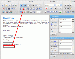
11. Drag a regular textbox and a label to collect telephone numbers.


12. Drag a submit button.